Why does the right size matter?
A photo uploaded straight from an iPhone into a typical blog article can easily weigh 2–4 MB at 4032×3024 resolution. Uploaded unchanged to the server, it causes:
- slow page loads (Google Core Web Vitals: poor LCP),
- wasted bandwidth, especially on mobile,
- the browser having to downscale the oversized image during rendering — so the extra resolution buys nothing visually while slowing everything down.
Pixel dimensions: how large do images actually need to be?
Web sizing is based on the CSS pixel: on a Retina display, 2 physical pixels correspond to 1 CSS pixel. The main rules of thumb:
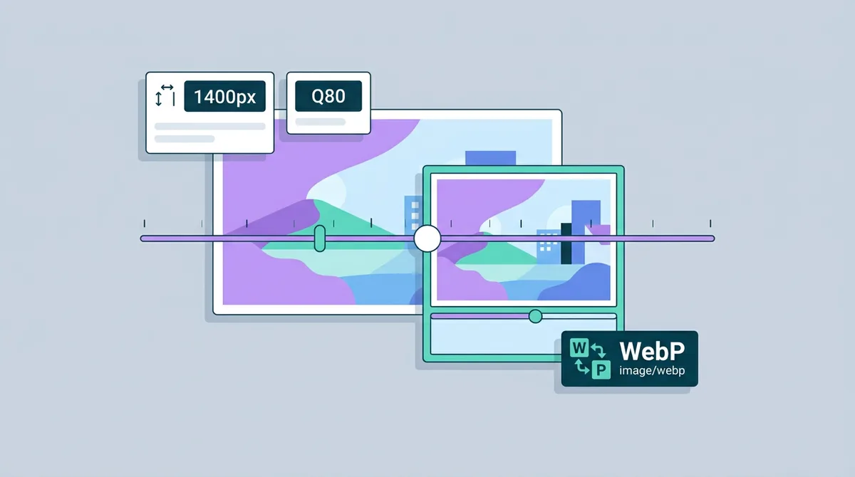
- Content image inside a container about 700 px wide: upload a file 1400 px wide.
- Hero / banner, full width: ideally 1920 px (at a 960 px layout that covers 2× Retina displays), though sites often go up to 2560 px when justified.
- Thumbnail / blog card: 2 × 400 = 800 px.
A caution about JPG: JPG works in 8-pixel blocks, so dimensions not divisible by 8 can cause a slight efficiency loss. It rarely matters in practice, but precise optimization takes it into account.
File size: target numbers
| Type | Target size |
|---|---|
| Blog article inline photo | 60–150 KB |
| Hero / large banner | 150–300 KB (WebP/AVIF) |
| Thumbnail / card | 20–50 KB |
| E-commerce product photo | 100–200 KB |
A modern website (by 2026 Google benchmarks) ideally aims for 500–800 KB total per page. If just two of your images weigh 2 MB, there's no “room” left for the other assets (scripts, styles, fonts).
The trade-off: quality vs. file size
For JPG, the quality level is denoted Q: Q75–85 is the ideal choice in most cases — visually almost identical to Q95, at half or a third of the size.
For WebP, Q80 is already entirely sufficient.
The Image Converter WebP conversion automatically optimizes your images — and with the WebP to JPG tool you can convert them back if an older website or CMS only accepts JPG.
Step by step: resizing your article images
- Open the Image Resizer page.
- Drop in your image (iPhone HEIC photos are handled automatically too).
- Set the width to 1400 px (height will adjust proportionally).
- If you want WebP, convert with the JPG to WebP tool.
- Upload to your website, and always include the
widthandheightattributes in the HTML:
<img src="article-photo.webp" alt="Description" width="1400" height="933" loading="lazy" />Specifying width and height prevents layout jumping while the page loads (Cumulative Layout Shift, or CLS) — a significant Core Web Vitals improvement.
Don't forget: lazy loading
Omitting the loading="lazy" attribute can hurt performance, because the browser downloads the image immediately whether it's visible or not. With lazy loading, images only load as the user scrolls to them.
Important: the hero image (which is the LCP element) must NOT be lazy-loaded! Images above the fold (visible immediately) should always use eager loading.
FAQ
Do I need to upload 2× Retina images?
Yes — but only when the image's container justifies it (e.g. an 800 px wide image inside a 400 px wide box). Oversized 3× images rarely add noticeable quality and just slow the page down.
Should icons be SVG?
Yes, always! Vector SVG is perfectly sharp at every resolution and usually smaller in file size. Our PNG to SVG converter doesn't automatically vectorize raster images, but it handles the basic format switch.
What's the best format for a website?
AVIF or WebP. Use JPG only when a third-party service (CMS, old WordPress plugins, social platforms) accepts nothing else.